In addition to helping students in the Integrated Product Development course at University of Michigan as a teaching assistant, I also worked with the professors and my colleague and created a set of promotional materials for recruiting students and advertising the “Product Launch” public event. As a graphic designer, I created the course recruitment posters, as well as a template for future product launch that could adapt to each year’s theme. I communicated with the web designer of the team and provided necessary visual components. I also worked on course materials like voting sheets.
Challenge
In the past, professors of this class spread out leaflets with basically pure text to advertise for the course. They would also collaborate with the Institute of Global Operation and present posters for the product launch in the arts and business buildings. However, these materials lack a universal design language, so students might be hard to relate them and realize they come from the same class. Therefore, the professors requested us to create a unified visual system – a brand for the course.
Another pain point of the course was the portion of student source. The class was quite well-known in the school of art and the school of information, but was not so recognized in the school of engineering and business. The professors want a more balanced student source, so the engineering and business aspects should be emphasized equally in the materials.
The third requirement is adaptivity. The materials would be presented in many locations in different dimensions, both physically and digitally, like posters, Instagram posts, big monitors, etc. The materials we design should be able to adapt to these forms.
Iteration 01
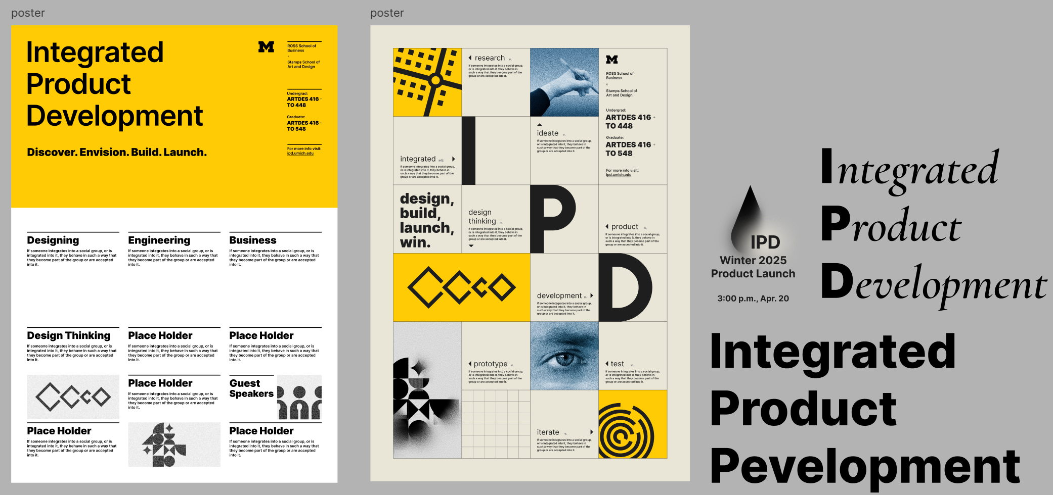
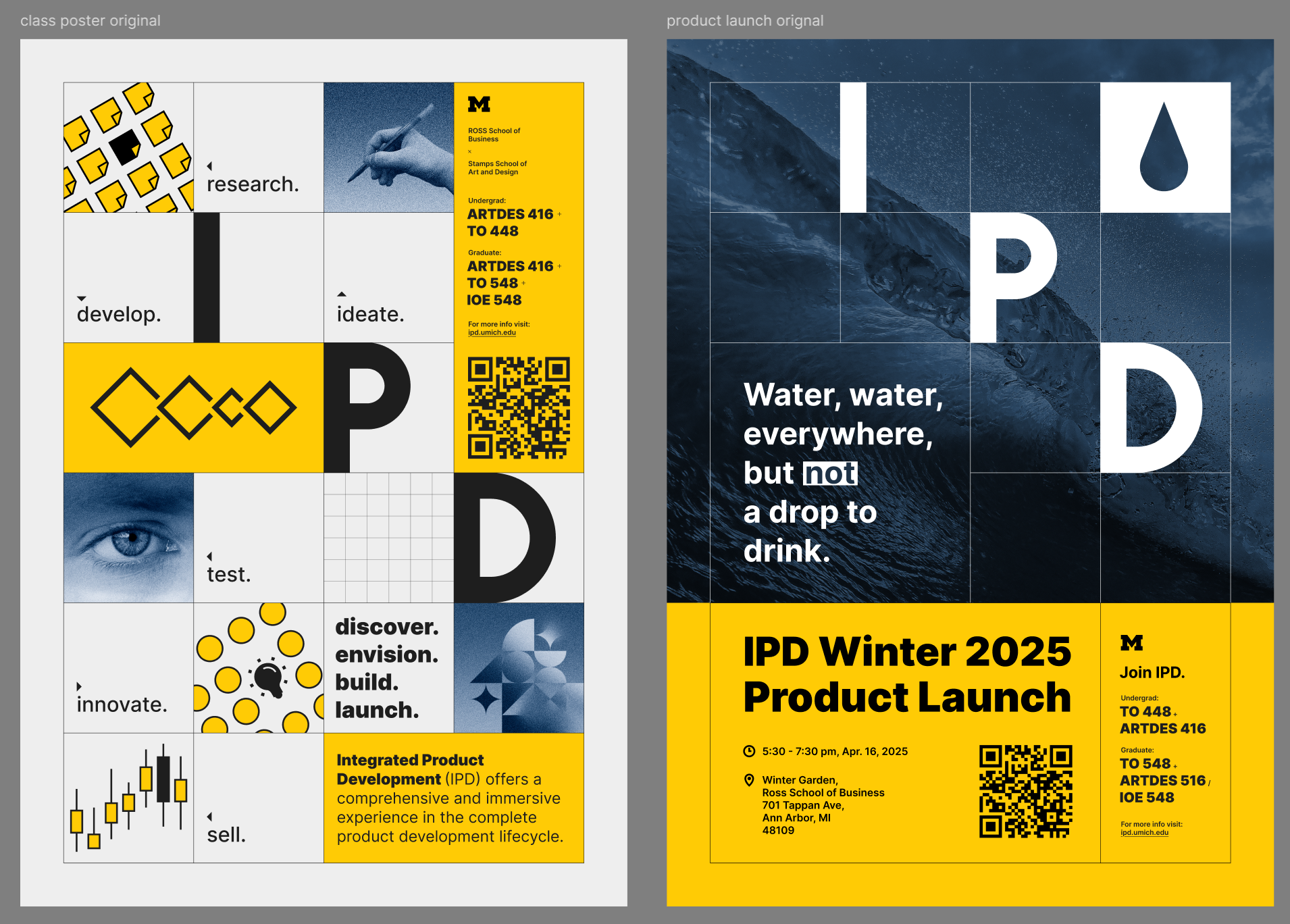
Course Recruitment Poster
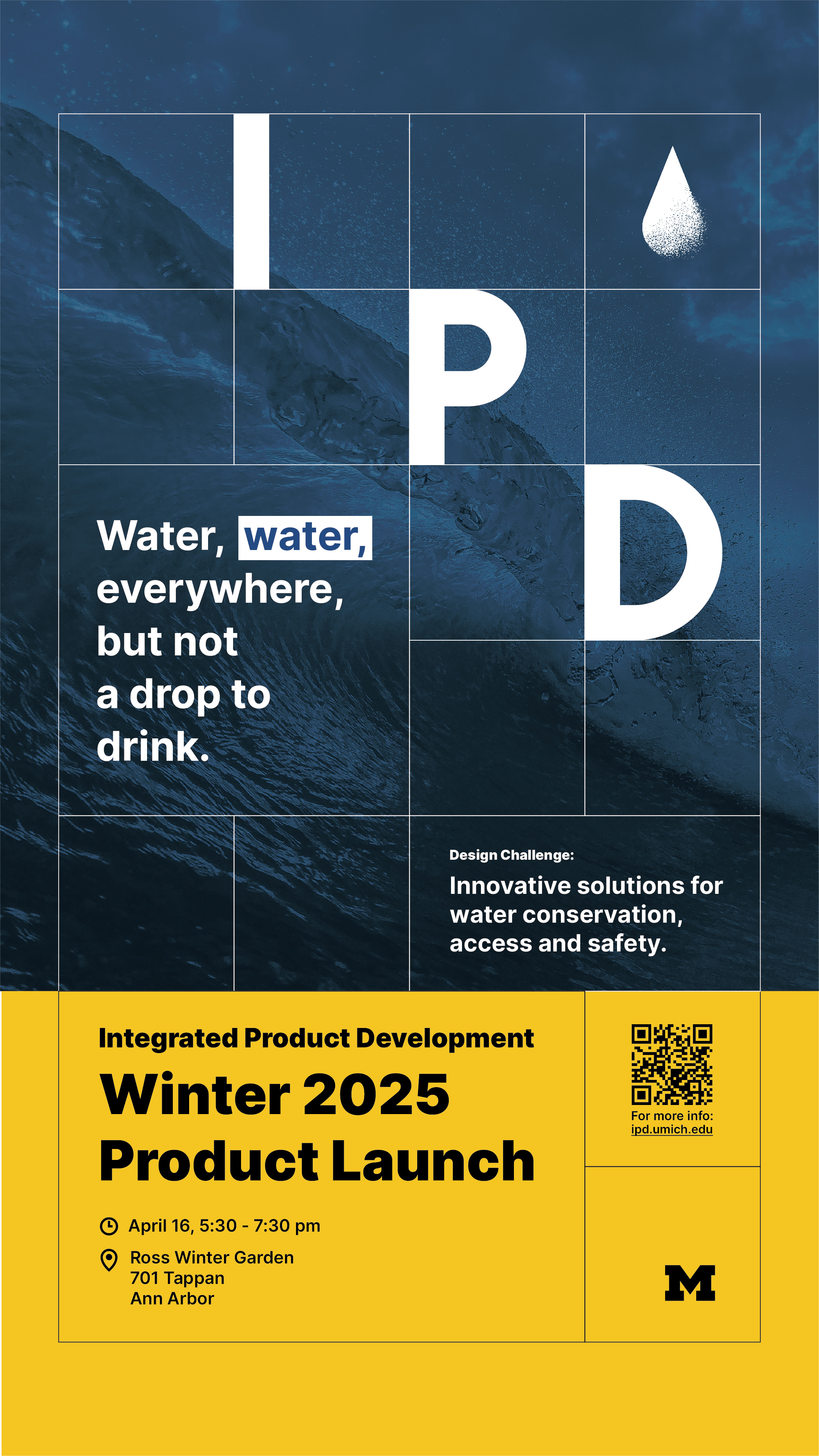
I chose gridline as the basic tone of the posters, because these squares could be easily rearranged and display on different platforms. The beige background represents the traditional draft paper color, implying the importance of sketching. the blue and yellow represent the color theme of UMich. I chose Inter as the primary typography, because it’s a modern font with a close relation with design.
I wrote down a list of keywords related to the course, and created abstracted icons and explanations for each of them, like the “double diamonds” and “design thinking”.
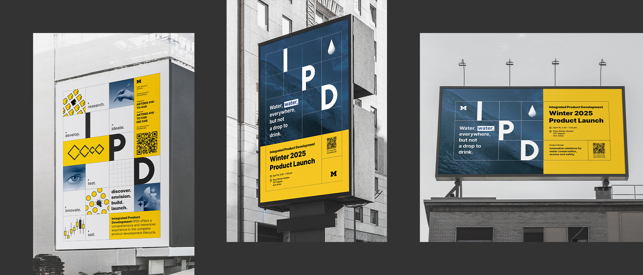
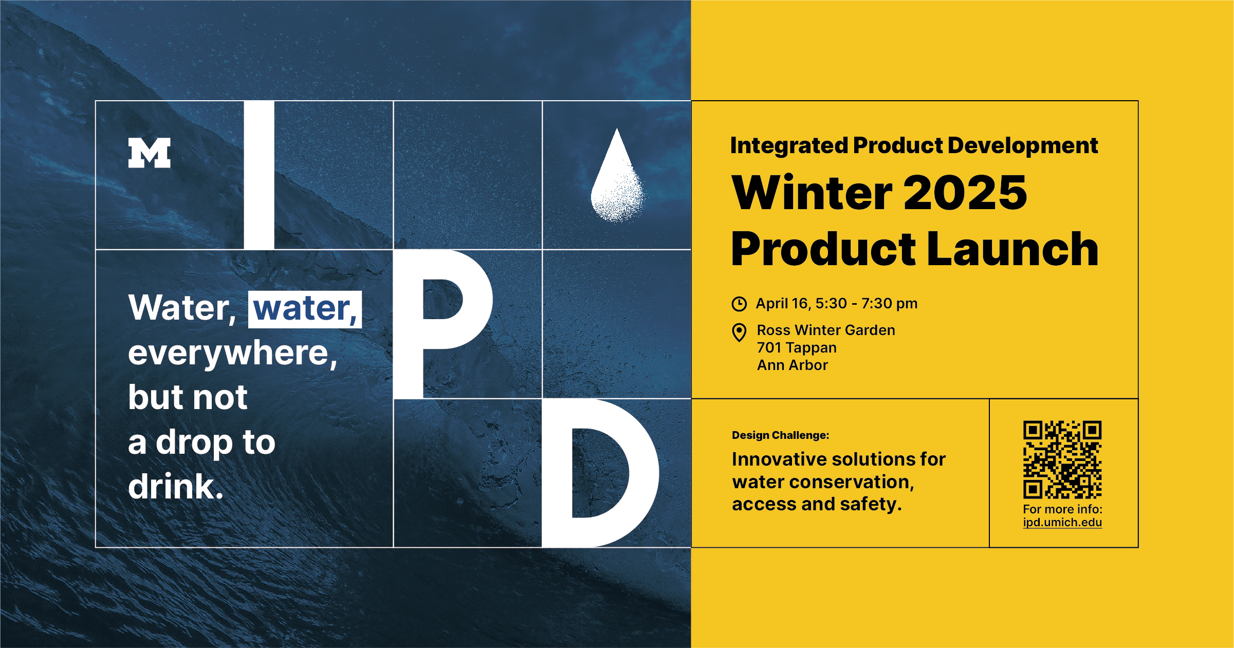
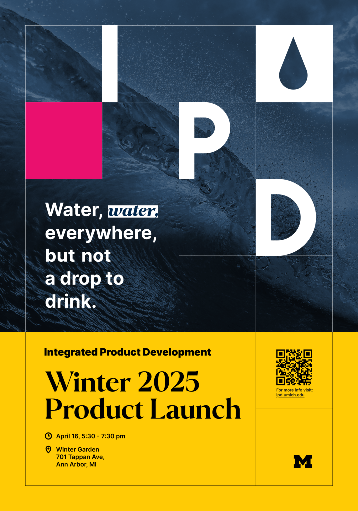
Product Launch Posters 01

Product Launch Posters 02
The design challenge, time, and location are the key information on the product launch poster. For example, the challenge of this year is close related to water, so I created a water drop icon, and the background is also related to water. In future years, new TAs could simply replace the background, icon, and text and get a new poster.
I chose Figma as the tool so the team would all see the progress and download materials if needed.
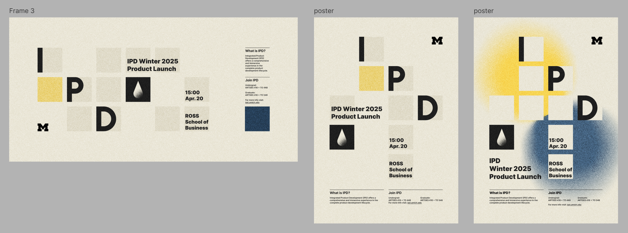
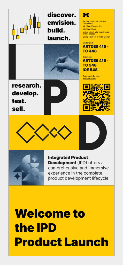
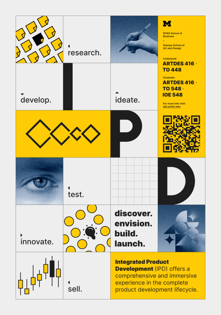
Iteration 02
The professors liked the grid idea, and together we refined the list of words. I recreated some icons and adjusted the brightness and saturation of the blue. I also emphasized the “grid” on the product launch poster, so they looked more unified.
Iteration 03
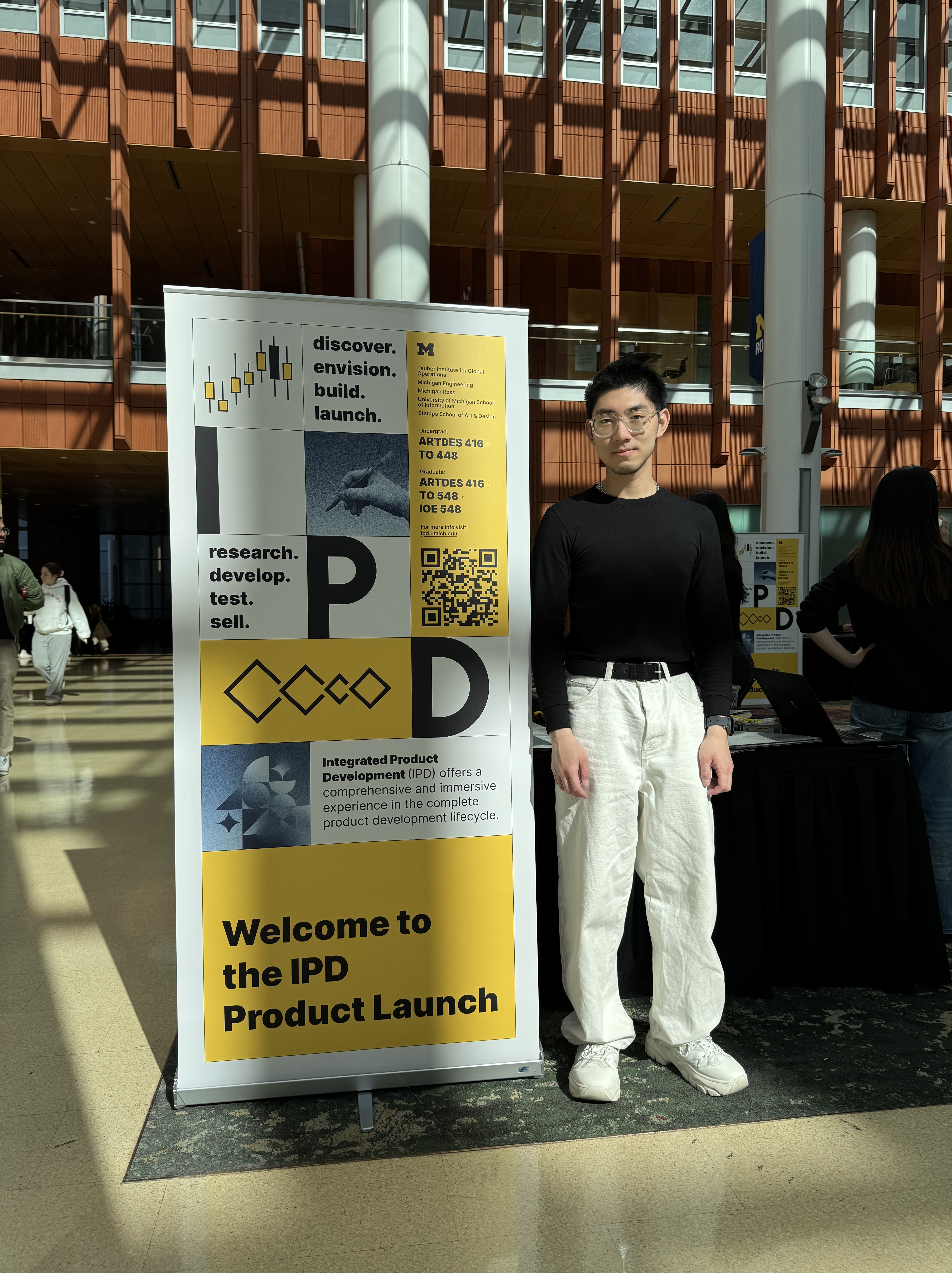
Roll-up Banner, Printed Poster
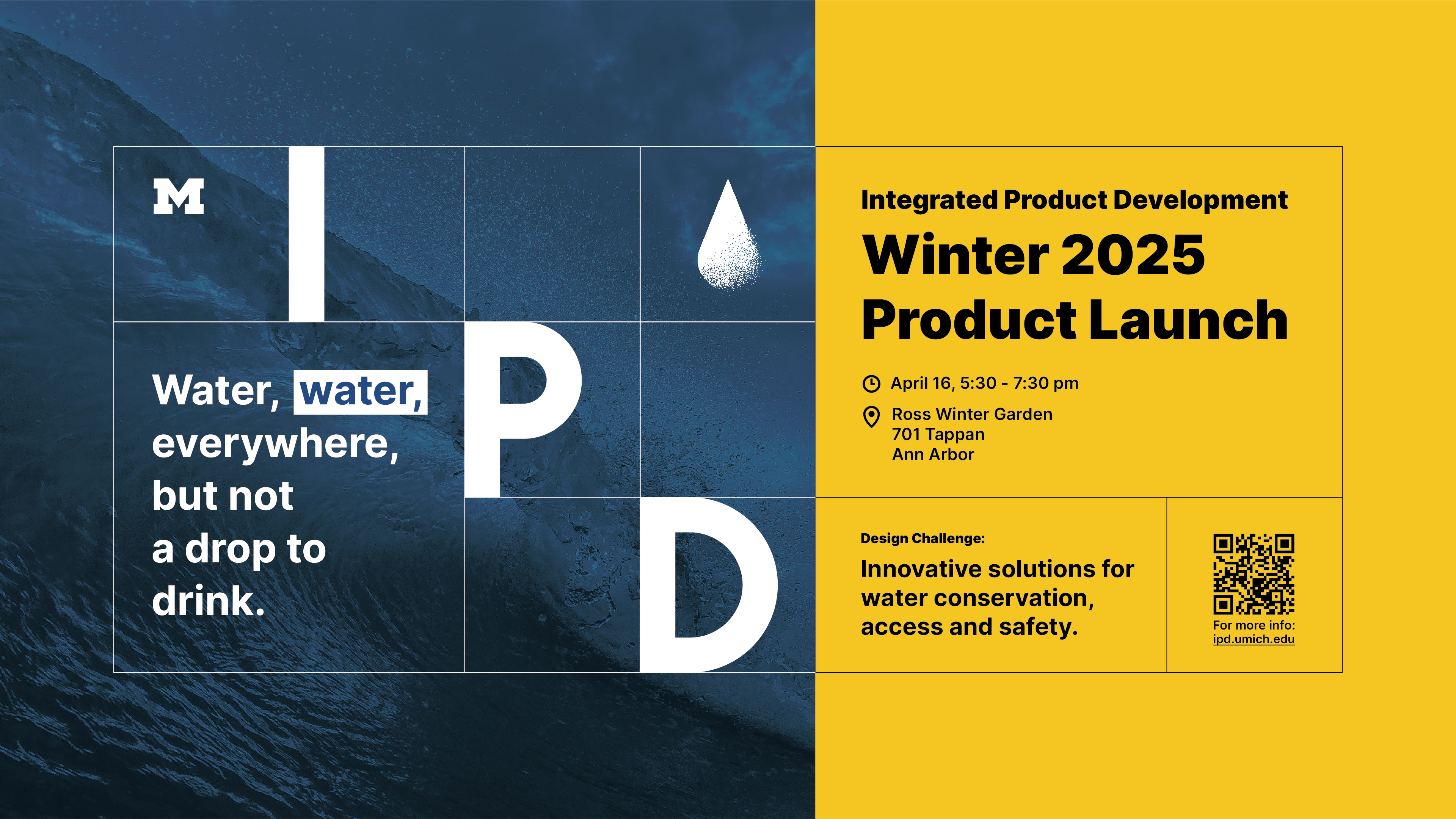
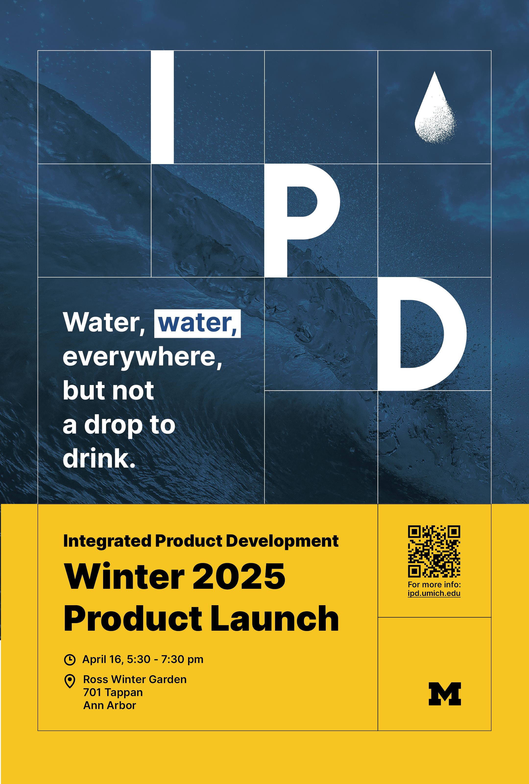
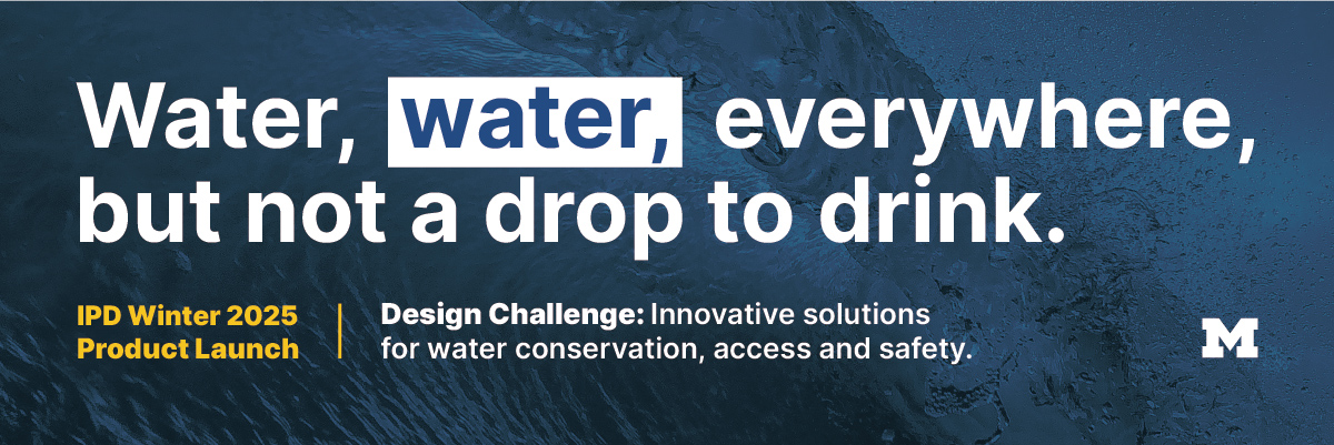
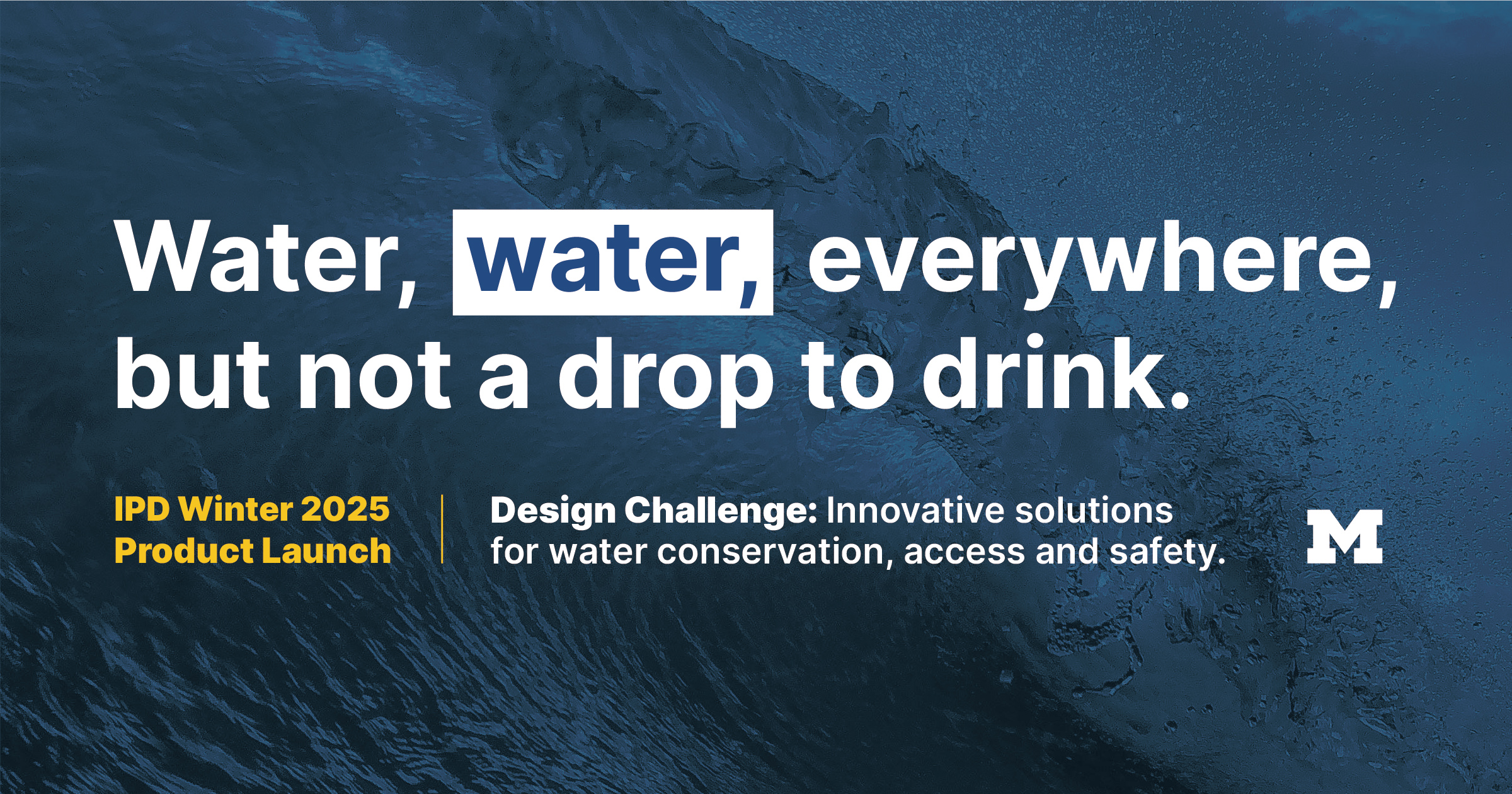
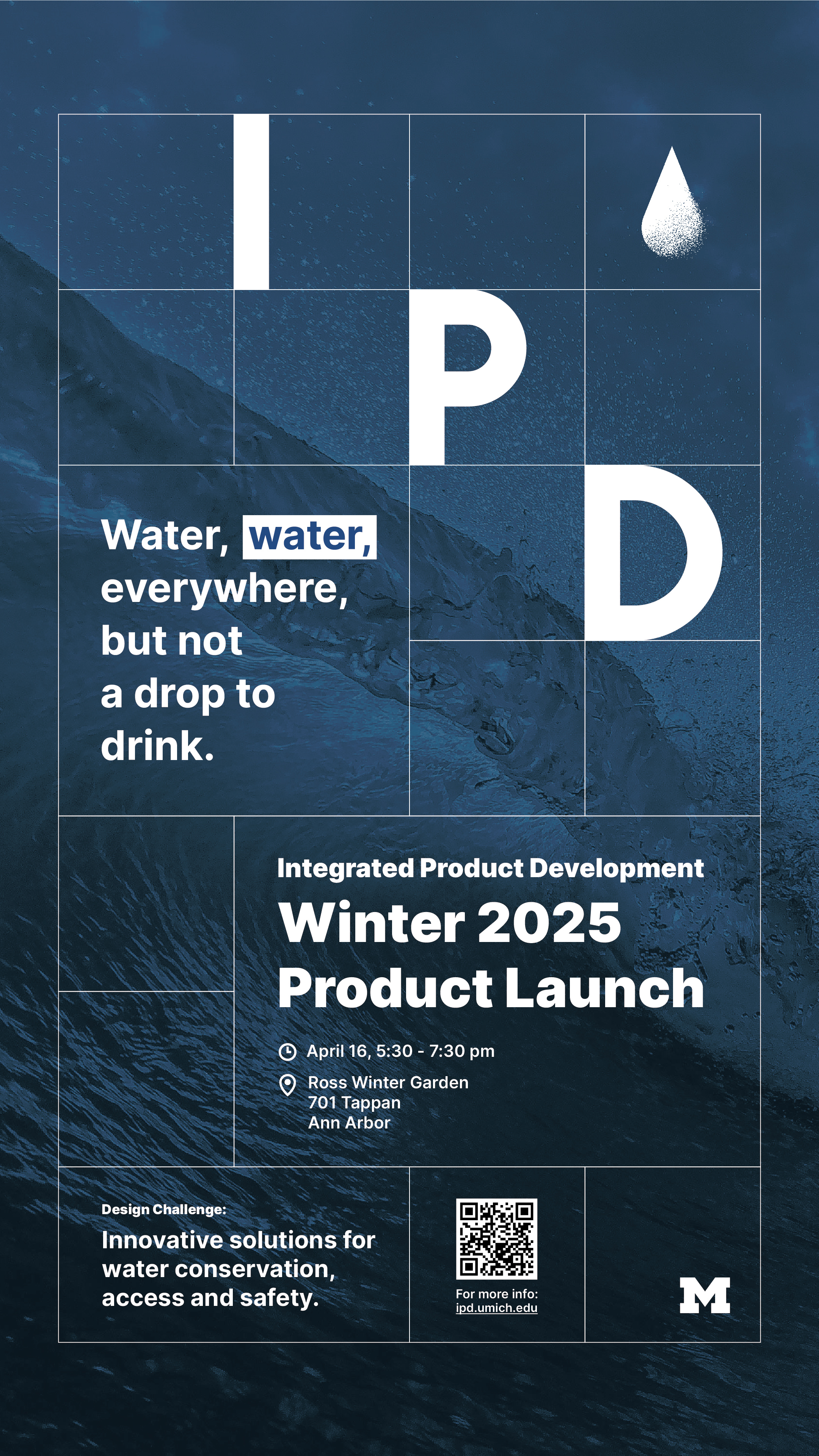
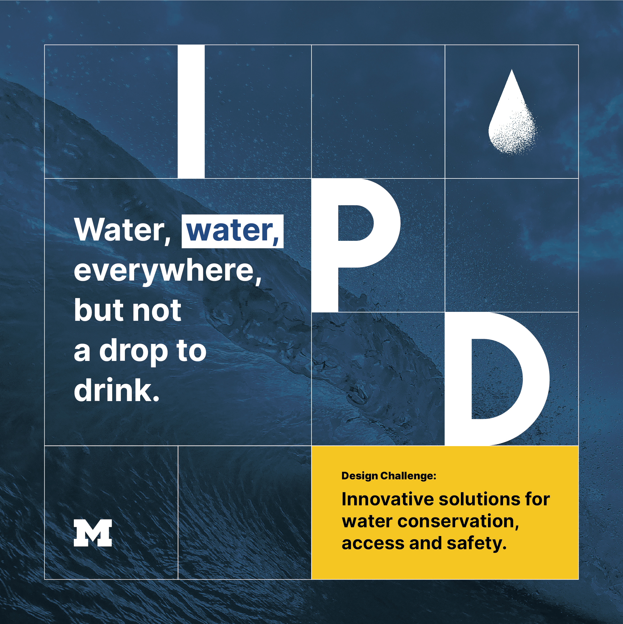
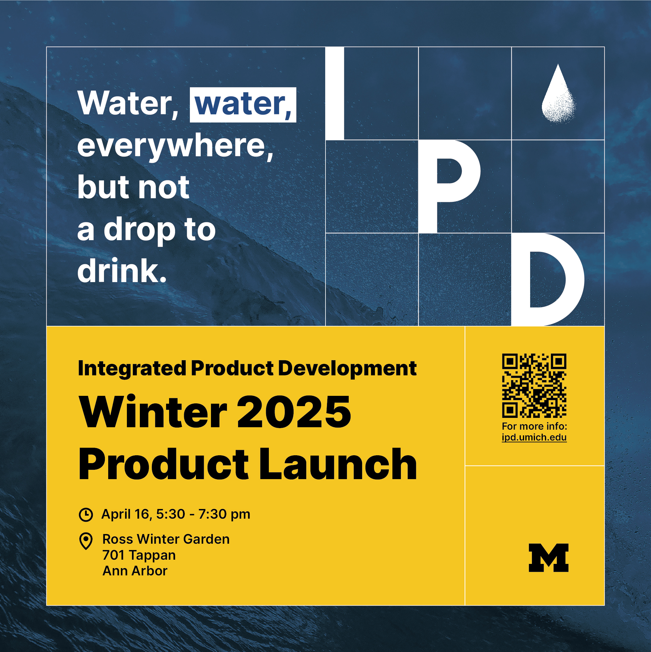
Product Launch Posters as different sizes
In the final iteration, I created variations of these posters in different dimensions so they could be displayed on different media. I chose Adobe Illustrator as the final tool so things could be exported correctly.
Course Materials
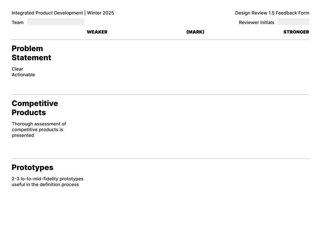
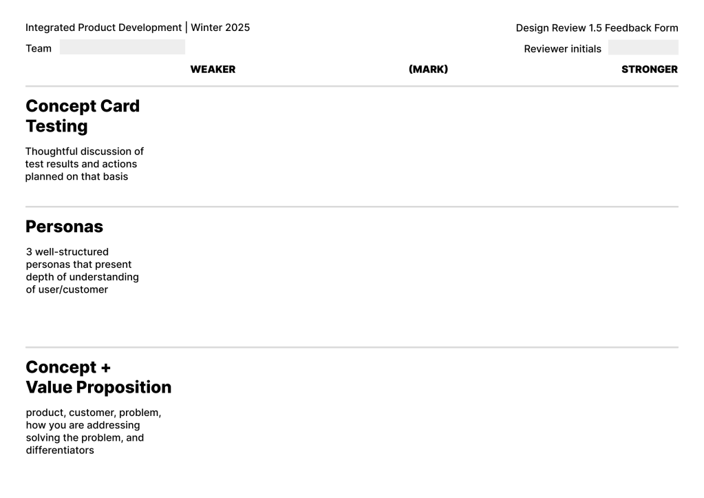
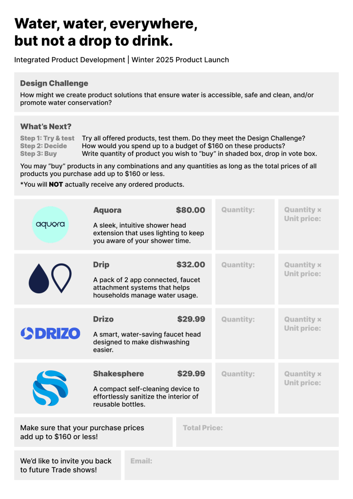
Feedback Forms, Voting Sheets
Future Explorations
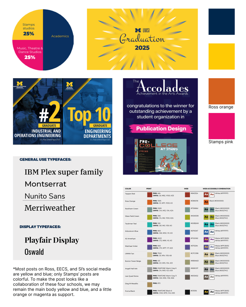
Before I graduated from the school, I made some exploration for possible future needs. I tried a more vibrant color theme, inspired by the design guide of UMich. I also added a secondary serif typography Blacklist.
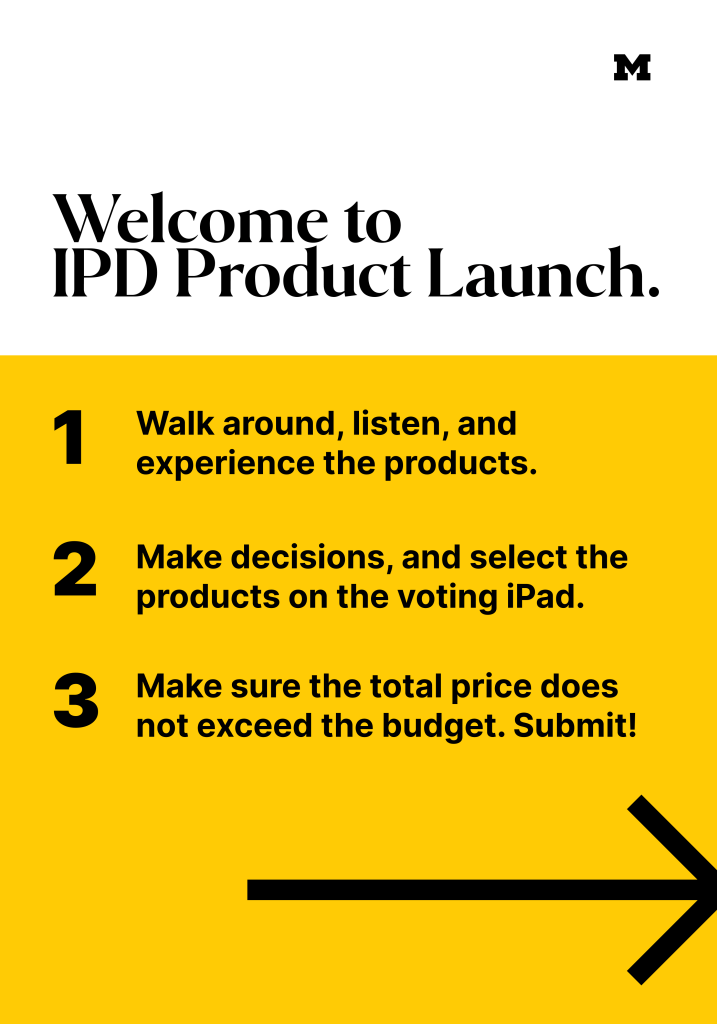
The second part is a voting instruction and interface. For all these years, the course had been using paper to vote, but that could cause a lot of problems, like sending the paper and collecting pen. Next year, the professors decided to use an eco-friendlier way, which is to vote on iPads.
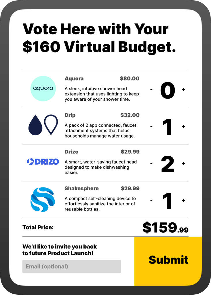
Voting Instruction, Voting iPad UI mock-up
Documentation