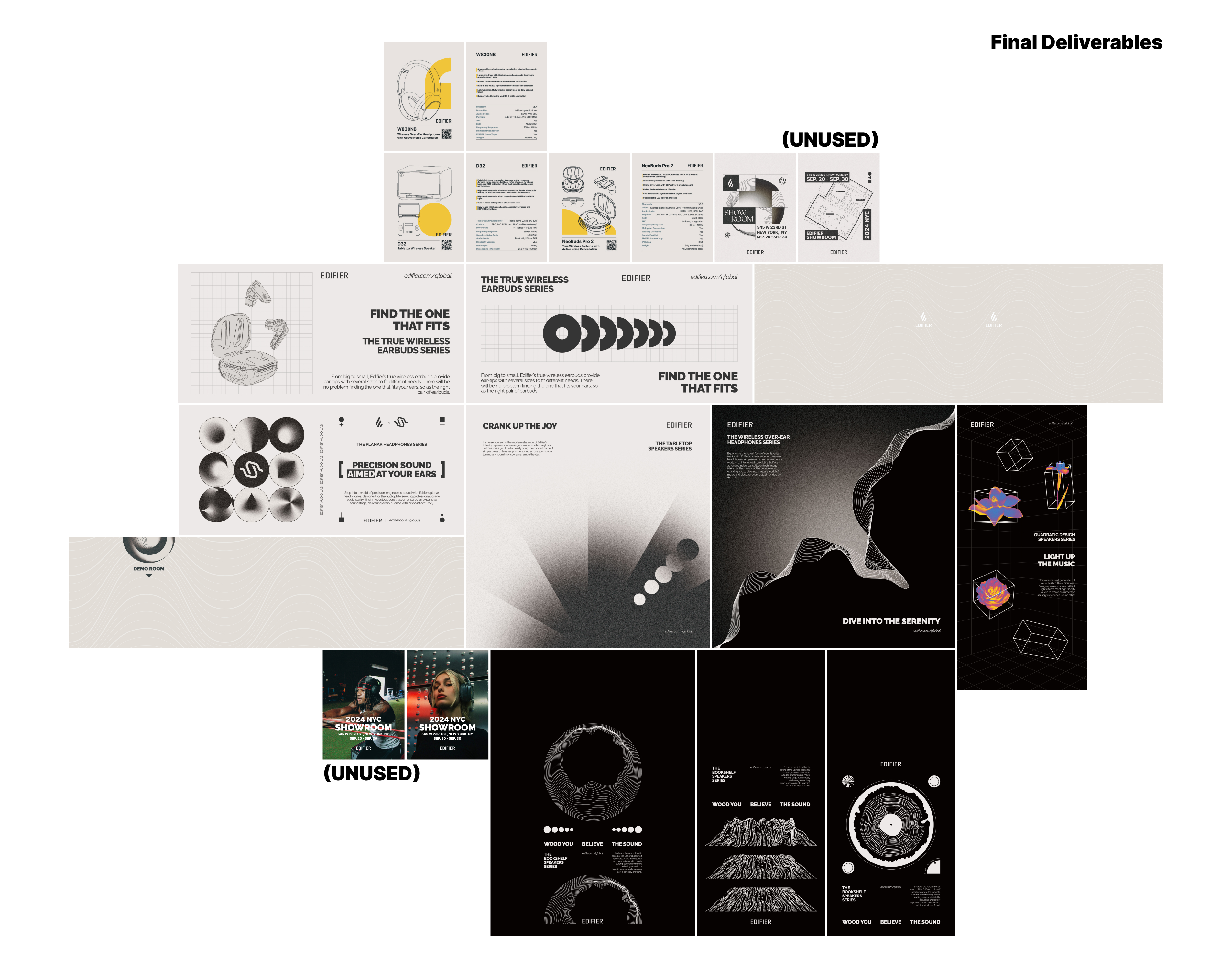
The SOUNDSTUDIO pop-up shop event held in NYC at the end of September 2024 is a commercial products showcase of Edifier, an audio equipment company. I worked in the company as a graphic design intern in the summer of 2024 and produced a series of graphic visualizations for this event. I fully contributed to the conceptual posters for the 6 product lines, and collaborated with my colleagues on the venue setups, social media materials, poster printing, etc.
Problem Statement
The challenge of this exhibition was to present the product in a visual style the brand had never tried before, within a small gallery space on the streets of New York. Our team aimed to integrate the product into the city’s unique cultural context, which meant moving away from the visual language we usually use in China.
This project required close collaboration among several teams: the Edifier international operations team (where I was based), the hardware design team responsible for the exhibition space, the construction team, and the product managers. As a graphic and environmental designer, my role was to align the needs across departments, study New York’s culture, highlight the product’s qualities, ensure the quality and transportability of poster materials, and coordinate the spatial properties of the curation space.
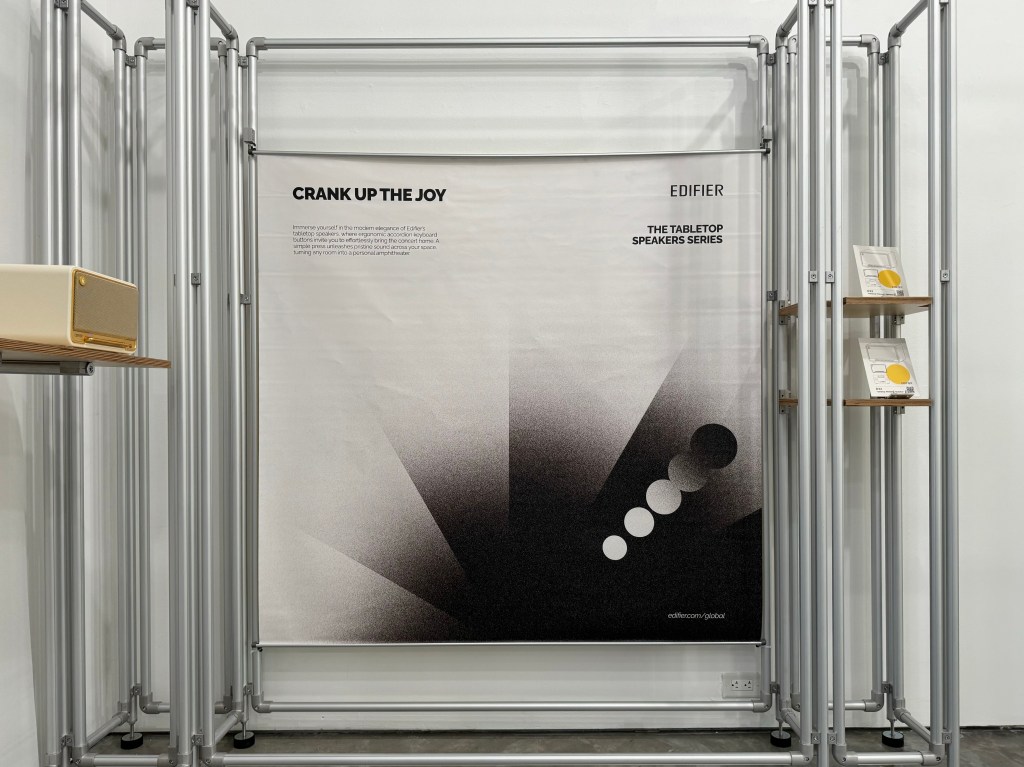
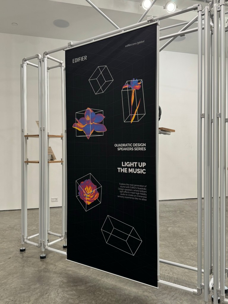
Product Line Posters
The first information I received was the location and form of the event. The program manager mentioned Broadway Boogie Woogie by Mondrian, which also has a background in NYC. Therefore, red, yellow, and blue were the initial color palettes of the whole visualization.
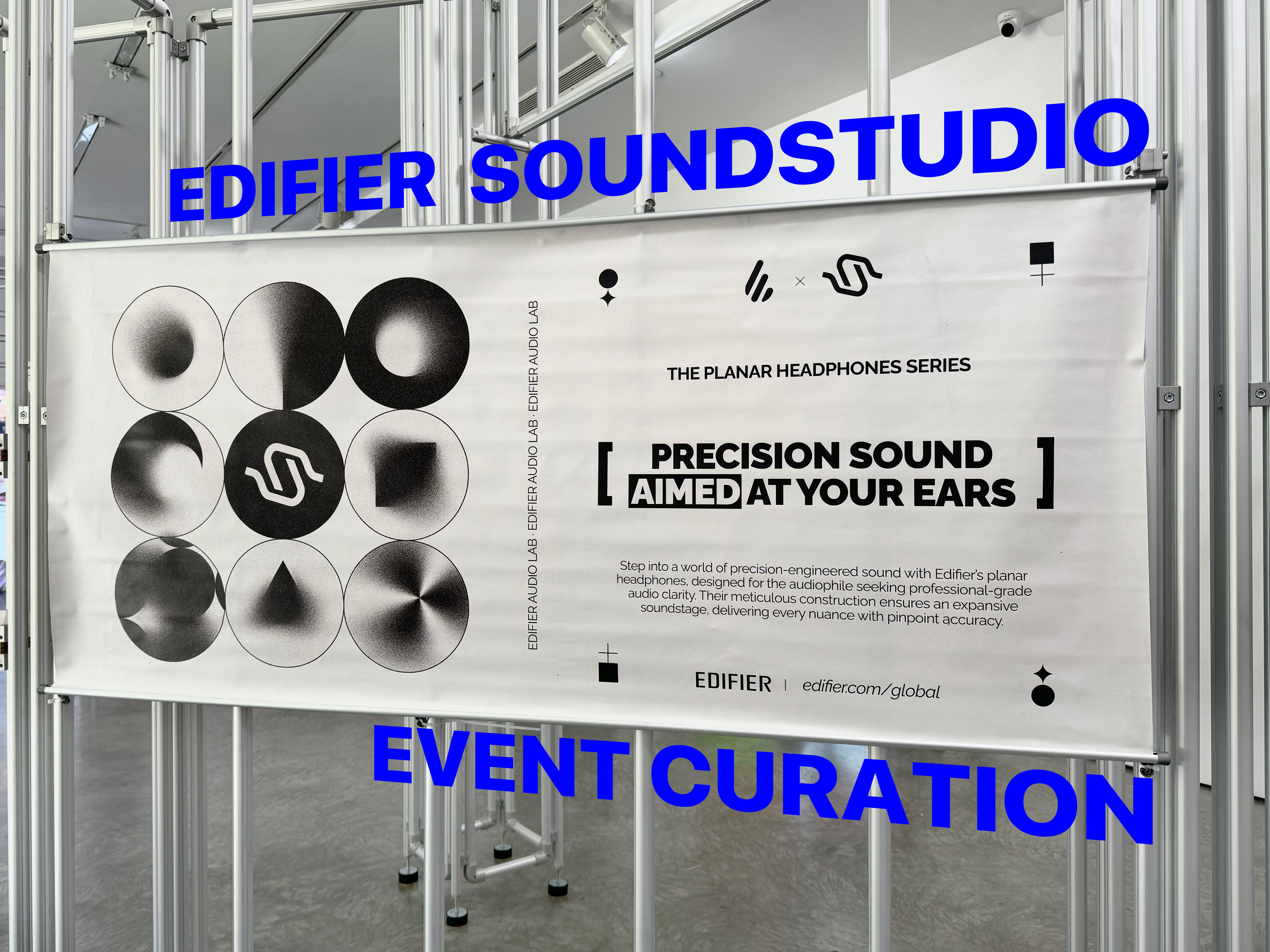
Based on this series of inspirations and products features, a list of keywords were written down as the initial prompt for this event:
Bauhaus, futuristic, saturation, noise, noise-cancellation, soundwave, experience, immersive, line-art, etc.
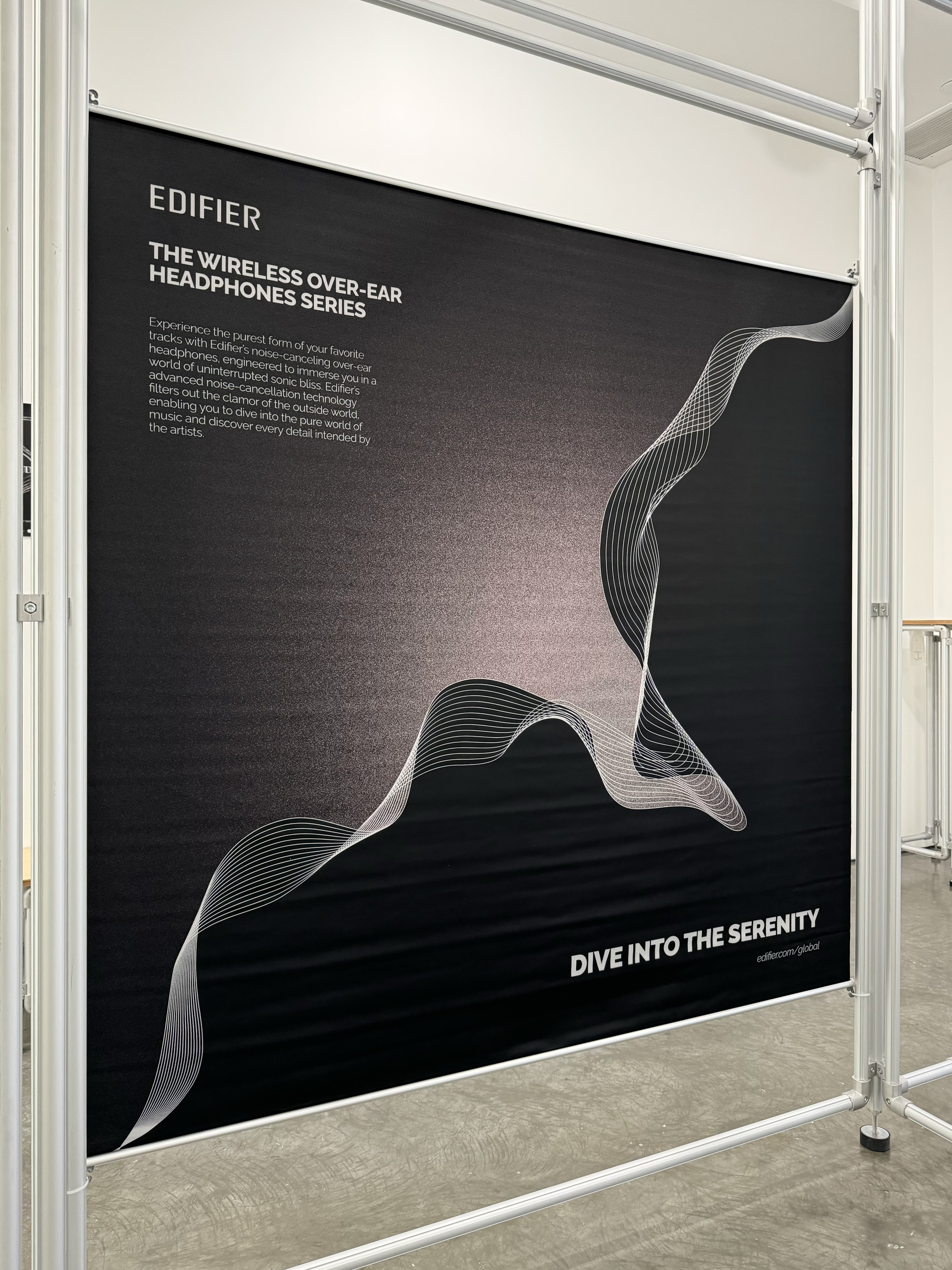
The first poster decided was “Dive into Serenity”. These headphones focus features noise cancellation, so a contrast between “noise” and “no noise” would be interesting. I tried a series of noise pattern vs. clean background, and finally, we chose the verb “dive” to emphasize the switch from noisy world to the music realm. Based on the first poster, I decided that I will make more experiments on “gradients” of noise in black and white.
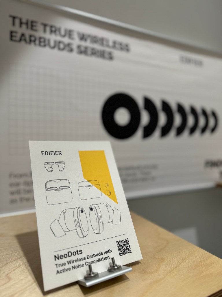
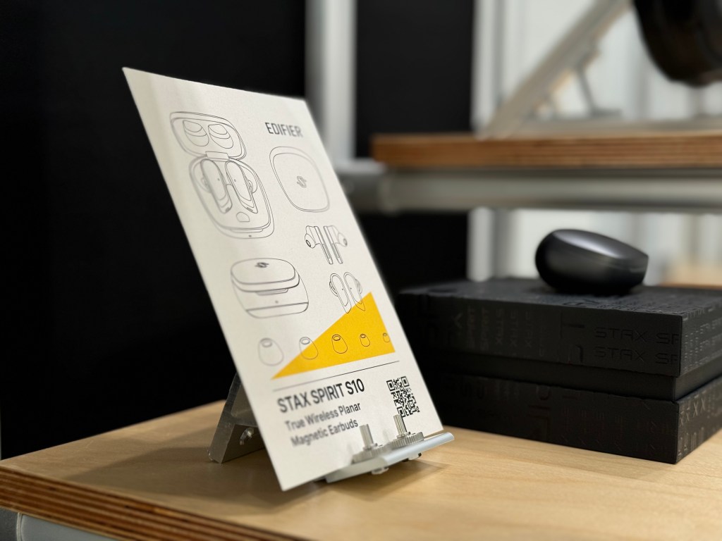
Product Cards
The second part of my job was designing “product cards” that demonstrate the properties of individual product. They would be placed near product samples to introduce the tech-specs. I communicated effectively with product managers to ensure the precision of details.
Surroundings
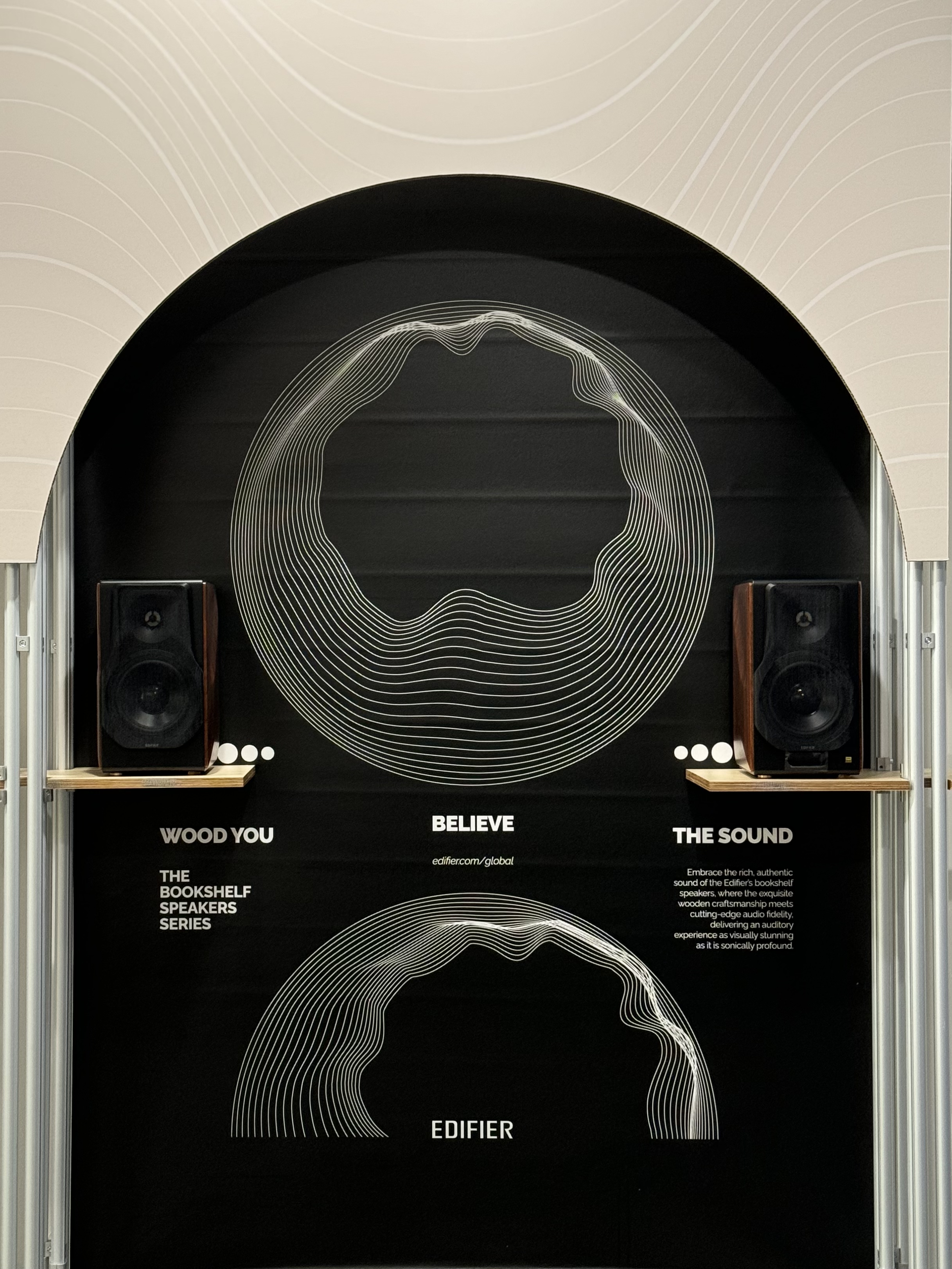
As the process was pushed forward, we saw more renderings and sample materials. The blue and red were fine, but the supplier could not provide the yellow we imagined. To make the rest of the materials and process smoother, the team changed the theme color to beige. The theme color was applied to surroundings, like the arch.
Final Deliverables